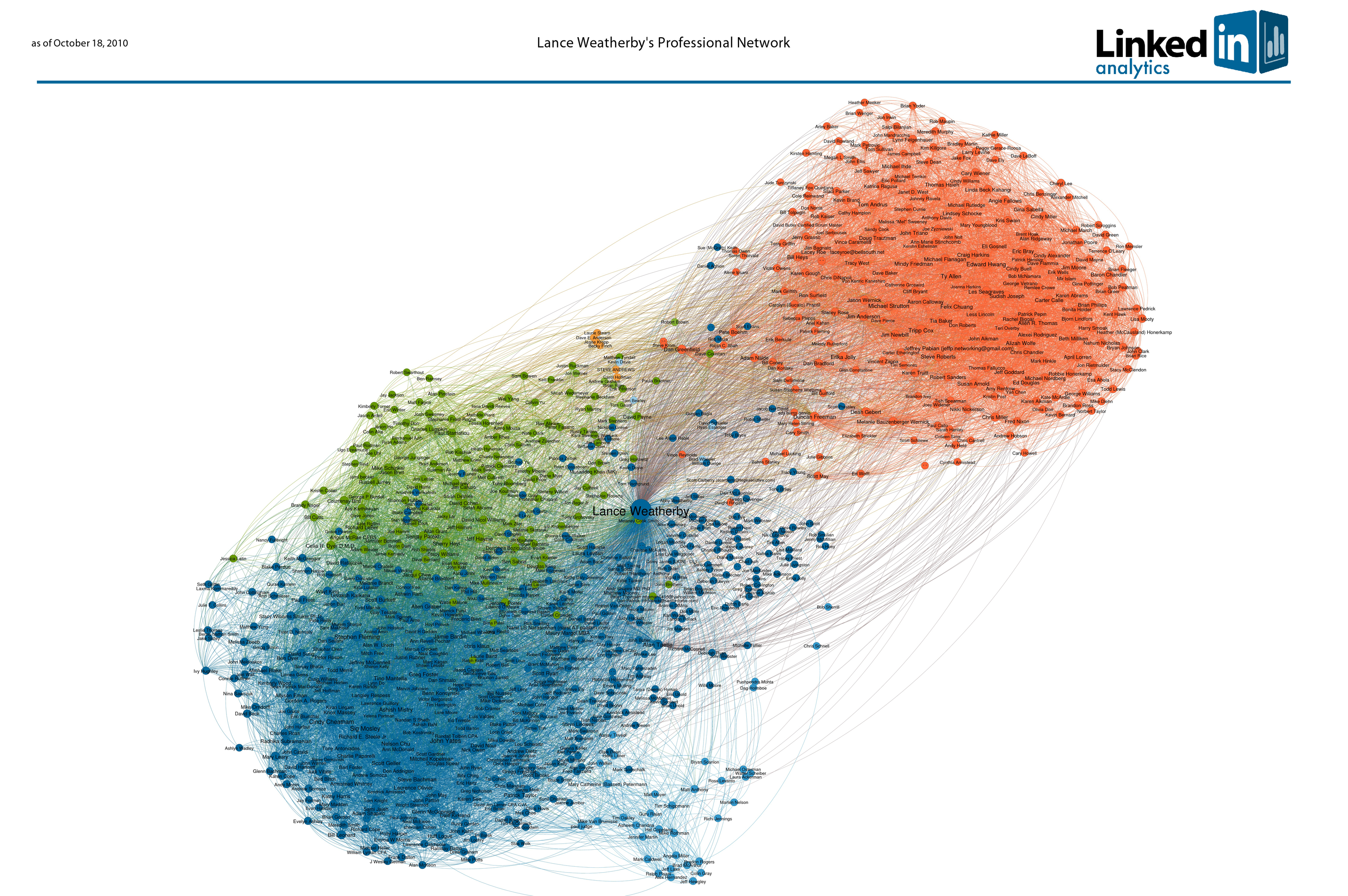
So my friend Russell Jurney, who is an analytics architect at LinkedIn, sent me my LinkedIn social graph. It's pretty cool.
According to Russell the colors represent clusters of well-connected people. Moving from lower left to upper right the clusters go something like this:
- Dark blue: Established Atlanta technology community
- Bondi blue: CipherTrust
- Green: Up and coming social/startup crowd
- Light orange: Kelley School of Business
- Baby blue: Indiana University
- Orange: EarthLink/MindSpring
It is interesting that there is no clear ATDC/Georgia Tech cluster.
The people between two of the various colors are the bridges between clusters. The up and coming startup gang is much more tightly networked with the established techies than one might expect. For the most part the MindSpring team is less connected and those closer to the other clusters seem to be more entrepreneurial.
If you double click you will get a full size image with all 800 or so of my LinkedIn connections named. The size of a person's circle reflects many people they are are connected to within my network. It's fun to play with. Would love to hear thoughts on your graph location as well as those you are connected with on LinkedIn.


